Operational Dashboards for Development Programmes: Measuring What Actually Matters
Dashboards should do more than display charts. Learn how development programmes can design operational dashboards that highlight risks, track field visits, monitor corrective actions and support faster decisions through enterprise-grade BI architecture.

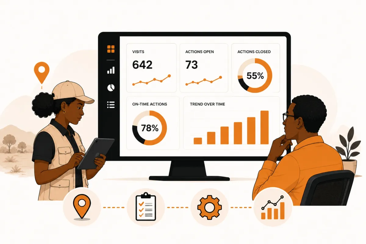
A dashboard should do more than display charts. It should help leaders decide what needs attention today, where operational risks are emerging and which actions will have the greatest impact on programme performance.
Key Takeaways
- Dashboards should support decisions, not simply report data.
- Executive dashboards answer different questions from operational dashboards.
- The most valuable metrics focus on action, accountability and risk.
- Business Intelligence platforms become increasingly important as programmes grow.
- Enterprise dashboard architecture matters just as much as dashboard design.
Search for "monitoring dashboard", "MEL dashboard" or "Power BI for NGOs", and you'll find hundreds of articles explaining how to build charts.
Bar charts.
Pie charts.
Maps.
KPIs.
Colour palettes.
Those articles are useful.
But they often overlook a more important question.
What decisions should your dashboard help someone make?
A Country Director doesn't open a dashboard because they want to admire visualisations.
A Programme Manager isn't interested in charts for their own sake.
They open dashboards because they need answers.
- Which projects require immediate attention?
- Which field visits are overdue?
- Which findings remain unresolved?
- Which corrective actions are behind schedule?
- Which programmes are becoming high risk?
Those are operational questions.
A good dashboard answers them immediately.
The best dashboard isn't the one with the most charts. It's the one that helps someone make the next operational decision.
Why Most Dashboards Fail
Many dashboards are built around available data instead of operational priorities.
As a result, they become collections of attractive charts that describe what happened last month while providing very little guidance about what should happen next.
Common symptoms include:
- Too many KPIs competing for attention.
- Historical reporting without operational context.
- No indication of overdue work or unresolved risks.
- Metrics that cannot be acted upon.
- Different departments calculating the same KPI differently.
When dashboards become reporting tools instead of decision-making tools, they create information—but not insight.
Reporting Dashboards vs Operational Dashboards
| Reporting Dashboard | Operational Dashboard |
|---|---|
| Explains what happened | Highlights what needs attention |
| Focuses on historical results | Focuses on current operational priorities |
| Monthly or quarterly reporting | Continuous operational visibility |
| Static charts | Action-oriented indicators |
| Measures performance | Improves performance |
Both dashboard types have value.
The challenge is that many organisations only build reporting dashboards when they actually need operational dashboards as well.
What Leaders Actually Need to See
The information a dashboard presents should depend on the decisions its audience needs to make.
A Country Director, for example, is rarely interested in the total number of forms submitted yesterday.
They are more likely to ask:
- Which programmes require intervention?
- Where are operational risks increasing?
- Which regions are falling behind schedule?
- Which corrective actions are overdue?
- Are donor commitments being met?
A Field Coordinator, on the other hand, needs a different view.
They need to know:
- Which visits are scheduled today?
- Which submissions still require review?
- Which sites need follow-up?
- Which findings remain open?
Good dashboards recognise that different roles require different operational perspectives.
Metrics That Actually Matter
Instead of measuring everything, focus on metrics that influence decisions.
| Operational Stage | Useful Metrics |
|---|---|
| Planning | Planned vs completed visits, coverage by programme |
| Execution | Completed visits, missed visits, GPS compliance |
| Review | Submissions awaiting review, average review time |
| Findings | Open findings by severity, recurring issues |
| Corrective Actions | Overdue actions, completion rate, verification status |
| Programme Health | High-risk sites, implementation trends, operational KPIs |
Notice that these metrics don't simply describe activity.
They highlight where action is required.
An operational dashboard should direct attention before problems become crises—not simply explain why they happened afterwards.
Real-World Dashboard Examples
Country Director
A strategic dashboard showing:
- programme performance across regions
- unresolved high-risk findings
- overdue corrective actions
- operational trends
- donor reporting status
Programme Manager
A dashboard focused on delivery.
- visit completion rates
- review backlog
- findings by project
- corrective action progress
- implementation risks
MEL Team
A dashboard centred on monitoring quality.
- submission quality
- indicator completeness
- data quality trends
- review turnaround times
- evidence verification
Field Coordinator
An operational dashboard for day-to-day execution.
- today's scheduled visits
- outstanding assignments
- pending reviews
- follow-up visits
- overdue actions
Each dashboard serves a different audience, but all should draw from the same trusted operational data.
Common Dashboard Mistakes
Many dashboards become less useful as more charts are added.
Common mistakes include:
- Measuring everything instead of prioritising key decisions.
- Mixing executive and operational information on one screen.
- Displaying historical metrics without highlighting current priorities.
- Creating different KPI definitions in different reports.
- Requiring users to export data before they can investigate issues.
Effective dashboards simplify decision-making rather than increasing information overload.
How Modern Operational Intelligence Platforms Solve This
The most effective operational dashboards are not created by adding more charts.
They are created by building an architecture that can deliver trustworthy, timely and scalable information to decision-makers.
The following principles apply regardless of which platform an organisation chooses.
They also explain how FieldOps has been designed to support operational reporting at enterprise scale.
Principle 1: Separate Operational and Analytical Workloads
Operational systems and analytical systems have different jobs.
Operational workloads prioritise speed and reliability for activities such as:
- scheduling field visits
- submitting monitoring forms
- reviewing evidence
- recording findings
- assigning corrective actions
Analytical workloads ask very different questions.
Leadership may want to analyse years of monitoring data across hundreds of projects, thousands of field visits and millions of monitoring responses.
Running those analytical queries directly against an operational database eventually becomes inefficient as programmes grow.
Modern Operational Intelligence platforms therefore separate transactional and analytical workloads.
Instead of repeatedly querying operational tables, they maintain analytics-optimised datasets designed specifically for reporting.
How FieldOps implements this
FieldOps maintains dedicated reporting datasets optimised for analytical queries while keeping day-to-day operational workflows responsive for programme staff, reviewers and field teams.
Principle 2: Connect Analytics Tools Instead of Replacing Them
Most organisations have already invested in reporting tools.
Replacing those investments rarely delivers value.
A better approach is to expose trusted operational data to the analytics platforms teams already know.
That allows organisations to continue using familiar visualisation tools while improving data quality and governance.
How FieldOps implements this
FieldOps exposes governed operational datasets through a secure BI API, allowing organisations to connect enterprise reporting tools including:
- Microsoft Power BI
- Tableau
- Microsoft Excel
- Other BI platforms
Instead of repeatedly exporting, cleaning and transforming spreadsheets, reports can be built from a consistent operational data model.
Principle 3: Use One Definition for Every KPI
Nothing erodes confidence in reporting faster than conflicting numbers.
If two dashboards calculate the same KPI differently, decision-makers quickly lose trust in both.
Modern Operational Intelligence platforms centralise business logic so every dashboard, report and analytics tool references the same operational definitions.
How FieldOps implements this
FieldOps maintains organisation-wide KPI definitions and curated reporting datasets so executive dashboards, operational reports and external BI tools all work from the same trusted metrics.
Principle 4: Design for Growth From Day One
Many dashboards perform well with a few thousand records.
Far fewer continue performing well when organisations accumulate years of operational history.
As programmes expand, leaders expect to analyse:
- multiple countries
- multiple implementing partners
- millions of monitoring responses
- long-term trends
- organisation-wide operational performance
Scalability therefore becomes an architectural requirement rather than a reporting feature.
How FieldOps implements this
FieldOps is designed for enterprise-scale operational reporting using analytics-optimised datasets, incremental synchronisation and a reporting architecture that enables Power BI, Tableau and other analytics tools to explore large operational datasets without placing reporting workloads on day-to-day transactional operations.
Enterprise dashboards are not defined by how many charts they contain. They are defined by whether they continue delivering fast, trustworthy insight as programmes grow from thousands to millions of operational records.
A Practical Dashboard Evaluation Checklist
Before investing time in a new dashboard—or a new reporting platform—ask whether it can answer the questions your organisation faces every day.
Operational Questions
Can the dashboard immediately show:
- Which field visits are overdue?
- Which findings require urgent attention?
- Which corrective actions are overdue?
- Which projects are falling behind plan?
- Which sites need another visit?
Management Questions
Can leadership quickly understand:
- Programme performance by region?
- Operational risks by project?
- Trends over time?
- Team workload?
- Donor reporting progress?
Technical Questions
Can the reporting architecture:
- Scale as programmes grow?
- Integrate with existing BI tools?
- Apply consistent KPI definitions?
- Protect organisation data?
- Deliver fast performance without affecting operational users?
If the answer to most of these questions is "no", the issue is probably not the dashboard design—it's the reporting architecture underneath it.
Dashboards should reduce the time between identifying a problem and making a decision.
Our Recommendation
Choose a reporting approach that matches your operational maturity.
If your organisation primarily needs periodic reporting, spreadsheet-based dashboards or simple BI reports may be sufficient.
As programmes become larger and involve multiple projects, regions, partners and implementing teams, prioritise platforms that provide:
- governed operational data
- role-specific dashboards
- consistent KPIs
- findings and corrective action visibility
- secure BI integrations
- enterprise scalability
The objective is not to replace familiar reporting tools.
It is to give those tools access to trusted operational information.
Final Thoughts
Dashboards are often seen as the final step in monitoring.
In reality, they are one of the first steps in decision-making.
A well-designed dashboard should tell a leader where to focus next.
It should highlight risks before they become crises.
It should reveal operational bottlenecks before they delay programme delivery.
Most importantly, it should connect evidence to action.
That is the difference between reporting data and delivering Operational Intelligence.
Move beyond data collection
FieldOps helps NGOs manage field visits, monitoring templates, findings, corrective actions, dashboards and donor reporting in one operational intelligence platform.
Learn more about FieldOps